 Don’t you get, sometimes, the pressure to quicly add a new feature in a design you find confusing?
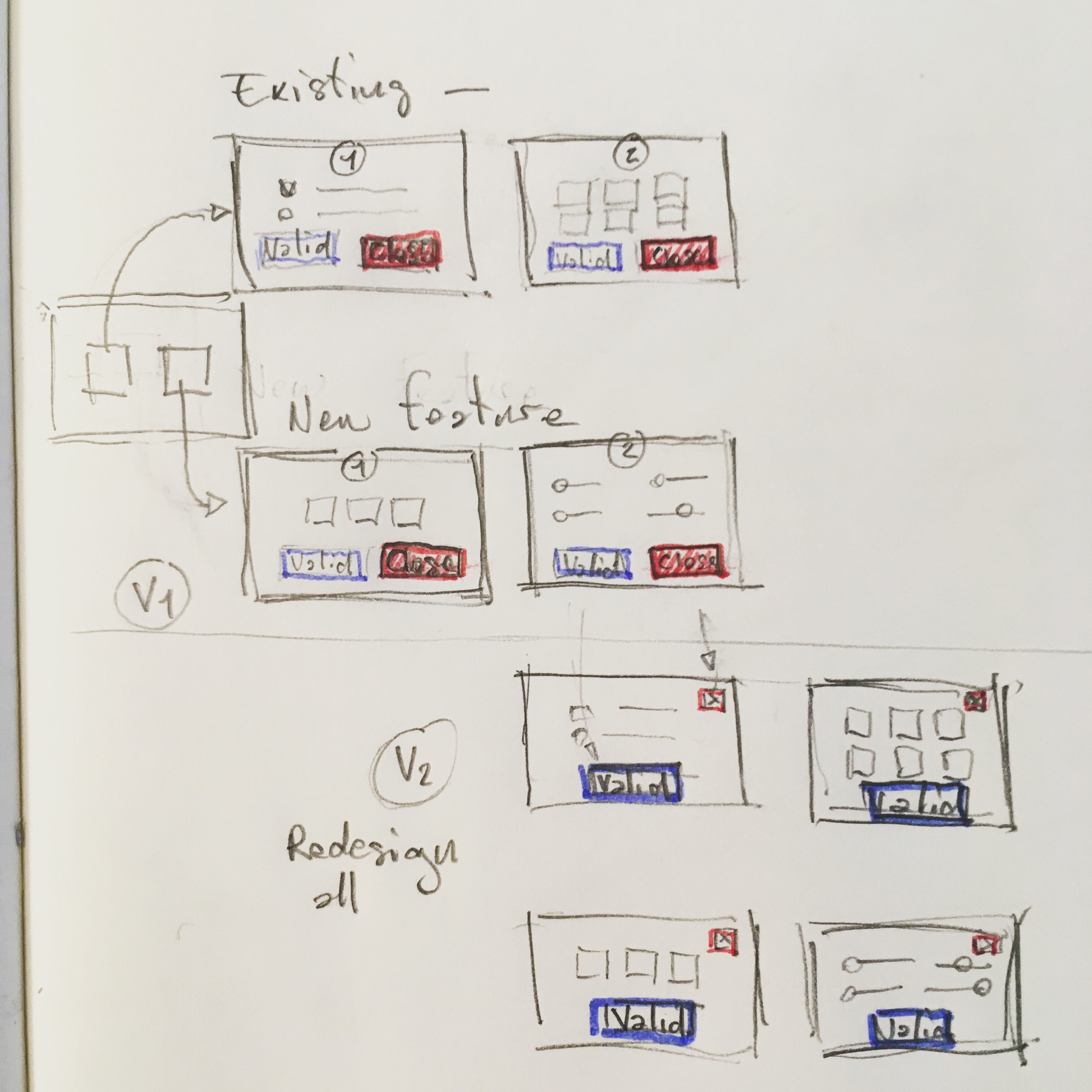
In this exemple, we had to add a feature in an existing app where everywhere, the « close » button was getting much more attention than the expected « validate » one.
Step 1.
As we needed to provide the new feature in a short notice, we had to design it based on the existing crappy design to provide consistency to the user. (frustrating isn’t it?)
Step 2.
And we had to postpone a global re-design of the entire application to smooth the user experience later.
In this exemple we did redesign the « close » button to lower its impact and separate it from the main action feed and brought up the « validate » one in a second version that came much later …
#ux #newfeature #poordesign #mvp #iteration
Laisser un commentaire