Un peu d’UX …
Porting an existing interface on the smalest device possible?
An interesting and beneficial chalange:
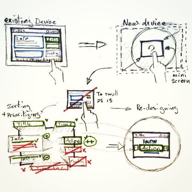 Here is a new device with a screen smaller than the smalest smartphones!
How would you port on it an interface that usualy run an a 9 inches screen?
Usualy, when we design an interface that is suposed to be ported on multiple screen sizes, we tend to say : » Lets do Mobile first ! ».
Well in our case the smalest screen size we used to display our interface was 9 inches screens.
So, when we’ve been asked to port the interface on a verry small (3.5 inches) screen we had to think twice about it.
One thing for sure, shrinking the interface as is would have been un-usable …
So, first thing we did was decomposing, and prioritizing all the different elements (and sub-elements) we had. (Note that we did’nt had componants librarie nor atomic design reflexes at that time)
Then we had to cut through most of those elements to be the most essential and synthetic for that new small interface.
Finaly we « re-atomic-designed » some brand new components on brand new screens.
2 benefits:
At the end, two good things came out of this exercise:
- 1st, we now have a much clearer and usable interface. (even probably more ergonomic than the larger one.)
- 2nd, we now have a more solid atomic design system based on the smalest screen possible (… so far) we could dream of.
Yay!!
#UX #UXdesign #atomicdesign #smalldevice #UXchallenge
Having to design a new feature on top of a confusing existing design!
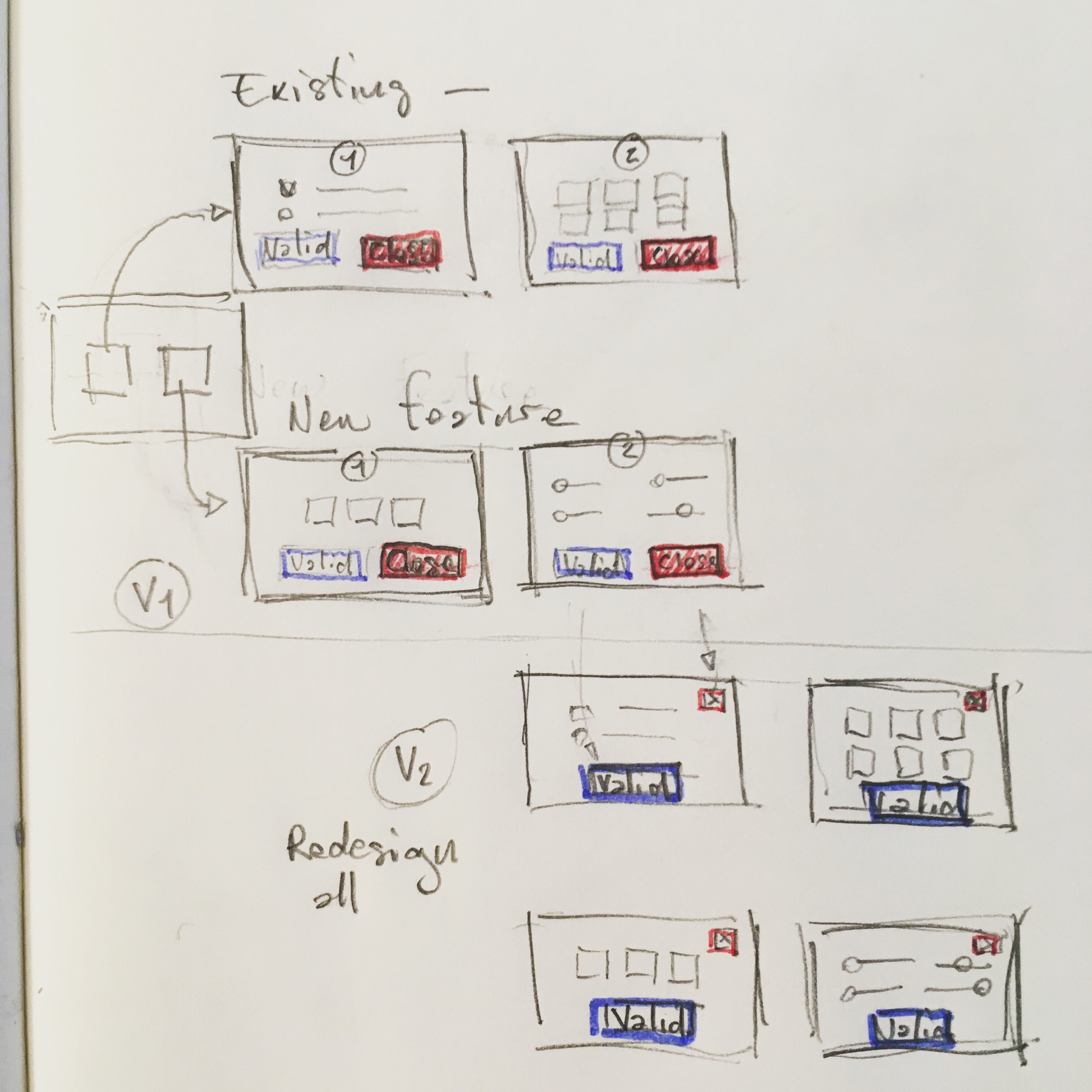 Don’t you get, sometimes, the pressure to quicly add a new feature in a design you find confusing?
In this exemple, we had to add a feature in an existing app where everywhere, the « close » button was getting much more attention than the expected « validate » one.
Step 1.
As we needed to provide the new feature in a short notice, we had to design it based on the existing crappy design to provide consistency to the user. (frustrating isn’t it?)
Step 2.
And we had to postpone a global re-design of the entire application to smooth the user experience later.
In this exemple we did redesign the « close » button to lower its impact and separate it from the main action feed and brought up the « validate » one in a second version that came much later …
#ux #newfeature #poordesign #mvp #iteration
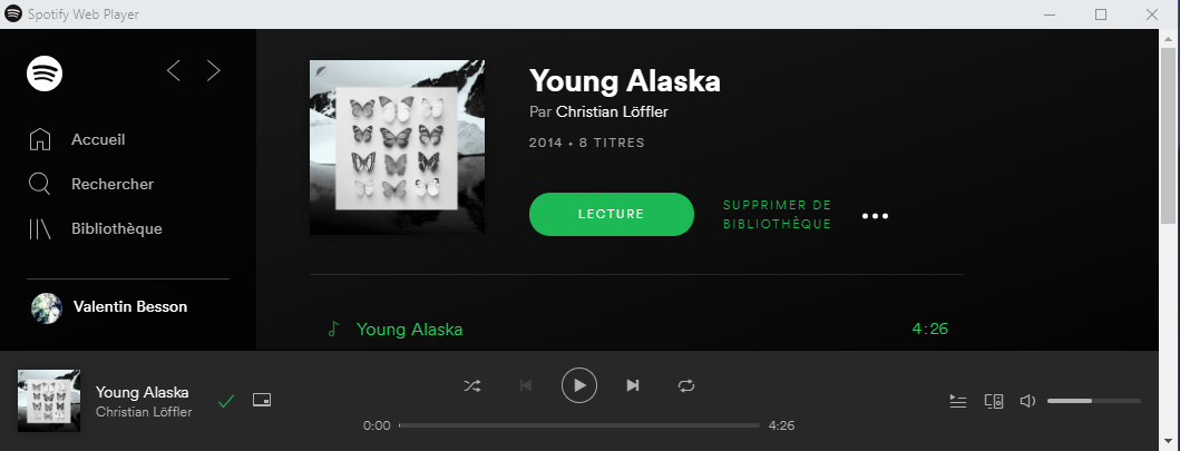
Une heureuse Expérience Utilisateur multi devices avec Spotify.
Surpris par une agréable expérience utilisateur sur Spotify au cours d’une tentative hasardeuse.
Contexte :
- Une écoute sur une webview Spotify sur un PC windows, au bureau
- Un iPhone, avec l’appli Spotify en tache de fond
- Une SmartWatch hybrid appairé au téléphone
Un parcours utilisateur seemless lorsque je tente, par réflexe, de contrôler ma musique depuis ma montre :
- La montre envoie les instructions sur l’appli. mobile.
- La syncro en ligne répercute la commande sur la webview sur mon poste de travail instantanément.
Ça fonctionne bien …
Bien joué Spotify !