An interesting and beneficial chalange:
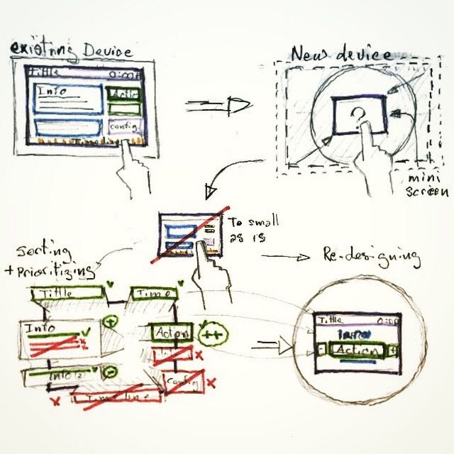
 Here is a new device with a screen smaller than the smalest smartphones!
How would you port on it an interface that usualy run an a 9 inches screen?
Usualy, when we design an interface that is suposed to be ported on multiple screen sizes, we tend to say : » Lets do Mobile first ! ».
Well in our case the smalest screen size we used to display our interface was 9 inches screens.
So, when we’ve been asked to port the interface on a verry small (3.5 inches) screen we had to think twice about it.
One thing for sure, shrinking the interface as is would have been un-usable …
So, first thing we did was decomposing, and prioritizing all the different elements (and sub-elements) we had. (Note that we did’nt had componants librarie nor atomic design reflexes at that time)
Then we had to cut through most of those elements to be the most essential and synthetic for that new small interface.
Finaly we « re-atomic-designed » some brand new components on brand new screens.
2 benefits:
At the end, two good things came out of this exercise:
- 1st, we now have a much clearer and usable interface. (even probably more ergonomic than the larger one.)
- 2nd, we now have a more solid atomic design system based on the smalest screen possible (… so far) we could dream of.
Yay!!
#UX #UXdesign #atomicdesign #smalldevice #UXchallenge
Laisser un commentaire